Frequency Distribution in Excel
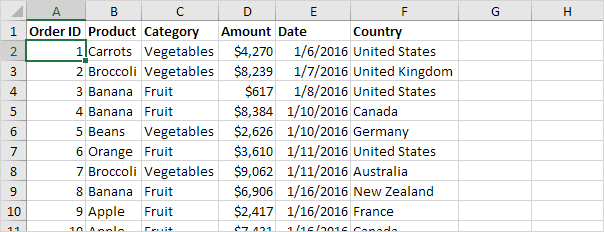
Did you know that you can use pivot tables to easily create a frequency distribution in Excel? You can also use the Analysis Toolpak to create a histogram.
Remember our data set consists of 213 records and 6 fields. Order ID Product Category Amount Date and Country.
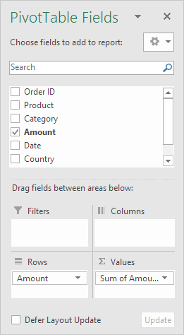
First insert a pivot table. Next drag the following fields to the different areas.
1. Amount field to the Rows area.
2. Amount field (or any other field) to the Values area.
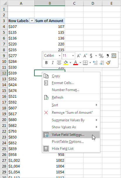
3. Click any cell inside the Sum of Amount column.
4. Right click and click on Value Field Settings.
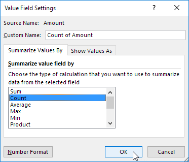
5. Choose Count and click OK.
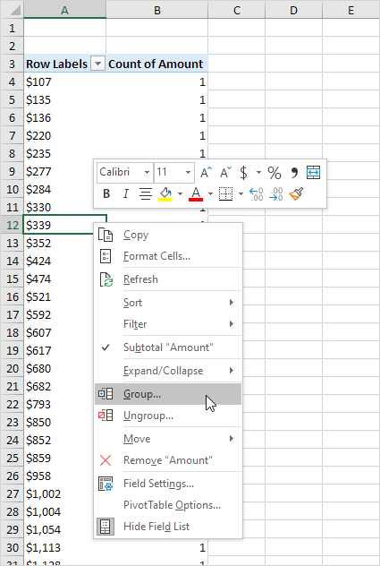
6. Next click any cell inside the column with Row Labels.
7. Right click and click on Group.
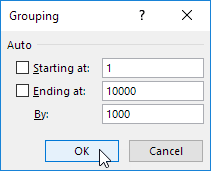
8. Enter 1 for Starting at 10000 for Ending at and 1000 for By.
9. Click OK.
Result:
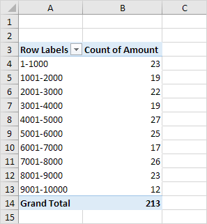
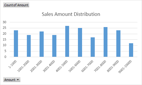
To easily compare these numbers create a pivot chart.
10. Click any cell inside the pivot table.
11. On the PivotTable Analyze tab in the Tools group click PivotChart.

The Insert Chart dialog box appears.
12. Click OK.
Result:
Written by
Jason Howie
Founder, FormulasHQ
A formula nerd with a passion for numbers and equations. Writes about Excel, Google Sheets, VBA, regex, and Salesforce formulas — for people who spend their day in spreadsheets.