Quick Analysis Tool in Excel
Use the Quick Analysis tool in Excel to analyze your data quickly. You can quickly calculate totals, insert tables, apply conditional formatting, and more.
Totals
Instead of displaying a total row at the end of an Excel table use the Quick Analysis tool to quickly calculate totals.
1. Select a range of cells and click the Quick Analysis button.
2. For example, click Totals and click Sum to sum the numbers in each column.

Result:

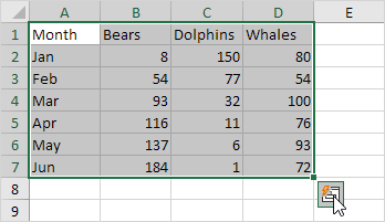
3. Select the range A1:D7 and add a column with a running total.

Note: total rows are colored blue, and total columns are colored yellow-orange.
Tables
Use tables in Excel to sort, filter, and summarize data. A pivot table in Excel allows you to extract the significance from a large, detailed data set.
1. Select a range of cells and click the Quick Analysis button.
2. To quickly insert a table, click Tables and click Table.

3. Download the Excel file (right side of this page) and open the second sheet.
4. Click any single cell inside the data set.

5. Press CTRL + q. This shortcut selects the entire data set and opens the Quick Analysis tool.
6. To quickly insert a pivot table, click Tables and click one of the examples in the pivot table.

Formatting
Data bars, color scales, and icon sets in Excel make it easy to visualize values in a range of cells.
1. Select a range of cells and click the Quick Analysis button.
2. To quickly add data bars, click Data Bars.

3. To quickly add a color scale, click Color Scale.

4. To quickly add an icon set, click Icon Set.
5. To quickly highlight cells greater than a value, click Greater Than.

6. Enter the value 100 and select a formatting style.

7. Click OK.
Result: Excel highlights the cells that are greater than 100.

Charts
You can use the Quick Analysis tool to create a chart quickly. The Recommended Charts feature analyzes your data and suggests useful charts.
1. Select a range of cells and click the Quick Analysis button.
2. For example click Charts and Clustered Column to create a clustered column chart.

Sparklines
Sparklines in Excel are graphs that fit in one cell. Sparklines are great for displaying trends.
1. Download the Excel file (right side of this page) and open the third sheet.
2. Select the range A1:F4 and click the Quick Analysis button.

3. For example, click Sparklines and then Line to insert sparklines.

Customized result:

Written by
Jason Howie
Founder, FormulasHQ
A formula nerd with a passion for numbers and equations. Writes about Excel, Google Sheets, VBA, regex, and Salesforce formulas — for people who spend their day in spreadsheets.