Clustered Column Chart in Excel
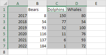
Column charts are used to compare values across categories by using vertical bars.
To create a column chart execute the following steps.
1. Select the range A1:A7 hold down CTRL and select the range C1:D7.
2. On the Insert tab in the Charts group click the Column symbol.
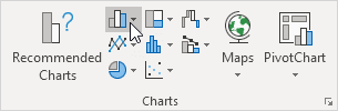
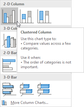
3. Click Clustered Column.
Result:
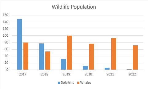
Note: only if you have numeric labels empty cell A1 before you create the column chart. By doing this Excel does not recognize the numbers in column A as a data series and automatically places these numbers on the horizontal (category) axis. After creating the chart you can enter the text Year into cell A1 if you like.
Written by
Jason Howie
Founder, FormulasHQ
A formula nerd with a passion for numbers and equations. Writes about Excel, Google Sheets, VBA, regex, and Salesforce formulas — for people who spend their day in spreadsheets.