Thermometer Chart in Excel
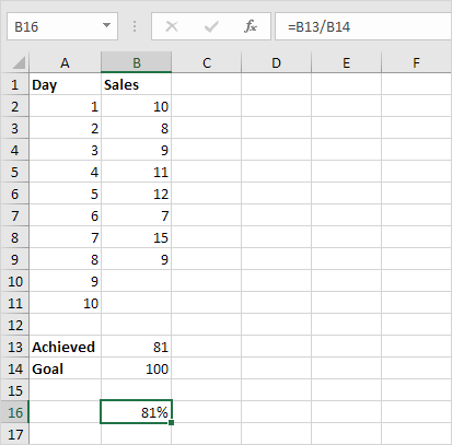
This example teaches you how to create a thermometer chart in Excel. A thermometer chart shows you how much of a goal has been achieved.
To create a thermometer chart execute the following steps.
1. Select cell B16.
Note: adjacent cells should be empty.
2. On the Insert tab in the Charts group click the Column symbol.
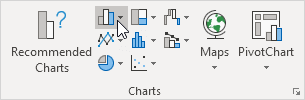
3. Click Clustered Column.

Result:
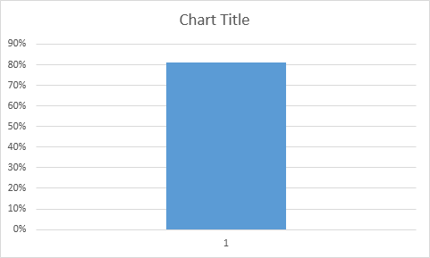
Further customize the chart.
4. Remove the chart tile and the horizontal axis.
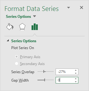
5. Right click the blue bar click Format Data Series and change the Gap Width to 0%.
6. Change the width of the chart.
7. Right click the percentages on the chart click Format Axis fix the minimum bound to 0 the maximum bound to 1 and set the Major tick mark type to Outside.

Result:

Written by
Jason Howie
Founder, FormulasHQ
A formula nerd with a passion for numbers and equations. Writes about Excel, Google Sheets, VBA, regex, and Salesforce formulas — for people who spend their day in spreadsheets.