Table of Contents
Excel is a widely used tool for managing spreadsheets, but is it good for creating dashboards? In this article, we will explore the capabilities of Excel in creating effective dashboards, the advantages and limitations of using Excel for this purpose, and compare Excel with other popular dashboard tools. We will also provide tips on how to make the most of Excel dashboards and highlight common mistakes to avoid. By the end of this article, you will have a better understanding of whether Excel is the right tool for your dashboard needs.
Understanding Excel Dashboards
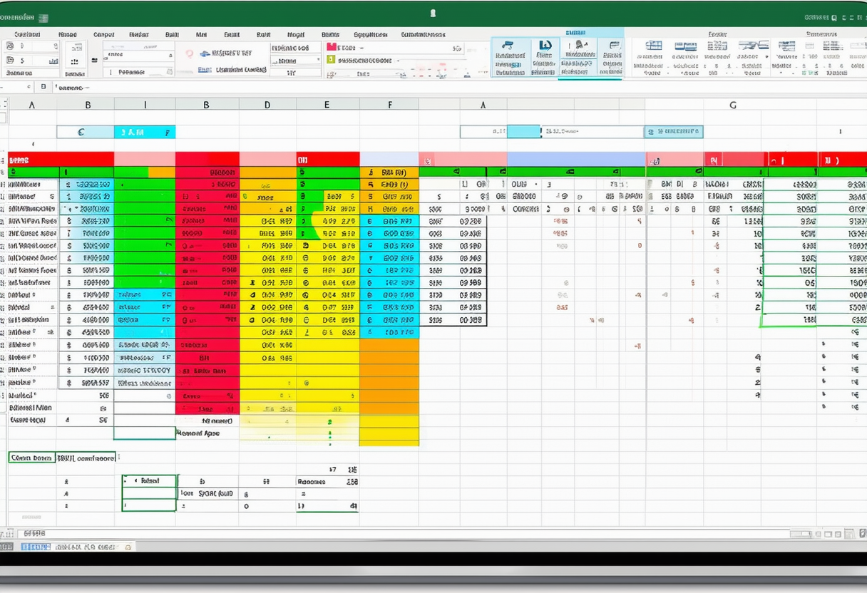
An Excel dashboard is a visual representation of data that provides a snapshot of key information in a concise and interactive manner. It consists of charts, graphs, tables, and other data visualization elements that allow users to quickly analyze and interpret data. Excel dashboards are commonly used in business and project management to track key performance indicators, monitor progress, and make data-driven decisions.
An Excel dashboard is a collection of worksheets or a single worksheet that presents data in a visually appealing and user-friendly manner. It typically includes a combination of charts, graphs, tables, and other data visualization elements. The purpose of an Excel dashboard is to provide a summary of important information, making it easier for users to understand and analyze complex data. Dashboards can be customized to fit specific needs and can be updated automatically as new data is entered.
Now, let’s dive deeper into the key features of Excel dashboards:
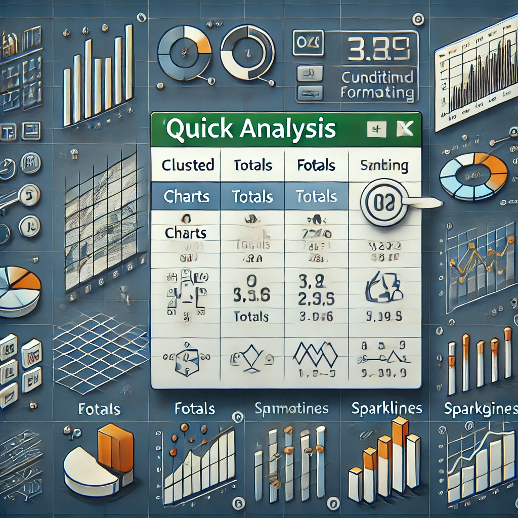
Interactive Charts and Graphs
Excel allows users to create dynamic charts and graphs that can be easily modified and updated. This interactivity enables users to explore data in greater detail and uncover insights. For example, users can hover over data points on a chart to view specific values or drill down into specific categories to analyze trends. This level of interactivity enhances the user experience and empowers users to make data-driven decisions.
Data Filtering and Slicing
With Excel, users can filter and slice data to focus on specific elements or subsets. This feature allows for deeper data analysis and helps users uncover patterns and trends. For instance, users can filter data based on specific criteria such as time periods, regions, or product categories. By narrowing down the data, users can gain a more comprehensive understanding of the underlying factors influencing their business or project.
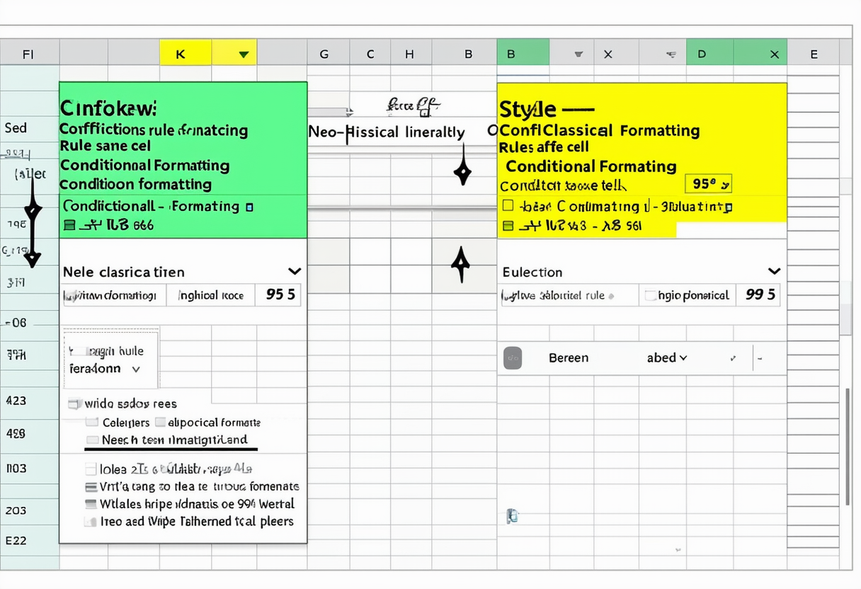
Conditional Formatting
Excel offers powerful conditional formatting options, allowing users to highlight specific data points based on criteria. This feature makes it easier to identify outliers or focus on areas of interest. For example, users can apply conditional formatting to highlight cells that meet certain conditions, such as values above or below a certain threshold. This visual emphasis draws attention to important data points and facilitates quick analysis.
Automated Data Refresh
Excel dashboards can be set up to automatically refresh data from external sources, ensuring that the displayed information is always up to date. This feature is particularly useful in scenarios where data is constantly changing, such as real-time sales data or project updates. By automating the data refresh process, users can save time and have confidence in the accuracy and relevance of the information presented in their dashboards.
By leveraging these key features, Excel dashboards provide a powerful tool for data visualization and analysis. They enable users to gain valuable insights, track progress, and make informed decisions. Whether you are a business professional, project manager, or data analyst, Excel dashboards can help you unlock the full potential of your data.
The Pros and Cons of Using Excel for Dashboards
Before deciding whether to use Excel for your dashboards, it’s important to consider the advantages and limitations of this tool.
Advantages of Excel Dashboards
Excel offers several benefits that make it a popular choice for creating dashboards:
- Familiarity: Excel is widely used and familiar to many users, which reduces the learning curve and allows for easy collaboration.
- Flexibility: Excel provides a wide range of tools and functions that can be used to manipulate and analyze data. This flexibility allows users to create customized dashboards tailored to their specific needs.
- Cost-Efficiency: Excel is part of the Microsoft Office suite, which means that most users already have access to it. This eliminates the need for additional software purchases and licensing fees.
- Integration: Excel can easily integrate with other Microsoft Office applications, such as PowerPoint and Word. This allows for seamless data transfer and reporting.
Limitations of Excel Dashboards
While Excel has many strengths, it also has some limitations that are worth considering:
- Data Size and Performance: Excel has limitations in handling large datasets, which can impact performance and slow down calculations.
- Data Source Complexity: Excel is primarily designed for structured data and may struggle with complex or unstructured data sources.
- Limited Collaboration: Although Excel allows for collaboration, it can become challenging when multiple users need to work on the same dashboard simultaneously.
- Less Visual Variety: Compared to specialized dashboard tools, Excel may have fewer options for visual customization and may not offer the same level of aesthetic appeal.
Comparing Excel with Other Dashboard Tools
While Excel is a popular choice for dashboards, it is not the only option available. Let’s compare Excel with two other widely used dashboard tools – Tableau and Power BI.
Excel vs. Tableau
Tableau is a powerful data visualization tool that offers advanced features and capabilities beyond what Excel provides. Tableau allows for more complex data analysis, offers a wider variety of visualizations, and can handle larger datasets more efficiently. However, Tableau has a steeper learning curve and requires a separate license.
Excel vs. Power BI
Power BI is a business analytics tool that integrates with Excel and provides enhanced dashboarding capabilities. It offers advanced data modeling and visualization options, as well as seamless integration with other Microsoft tools. Power BI is particularly useful for organizations that require real-time data analysis and interactive dashboards.
Making the Most of Excel Dashboards
To create effective Excel dashboards, consider the following tips:
- Define Your Objectives: Clearly define the purpose and goals of your dashboard to ensure that it aligns with your specific needs.
- Keep it Simple: Avoid clutter and focus on highlighting the most important information. Use clear labels and intuitive design to guide users.
- Choose the Right Visualization: Select the appropriate chart or graph type to effectively represent your data. Consider the message you want to convey and choose the visualization that best supports that message.
- Ensure Data Accuracy: Double-check your data sources and formulas to ensure accuracy. Mistakes in data input can lead to inaccurate insights and decisions.
- Regularly Update and Review: Keep your dashboard up to date by regularly refreshing the data and reviewing its relevance. As your business needs evolve, consider making necessary adjustments.
Common Mistakes to Avoid When Using Excel for Dashboards
Here are some common mistakes to avoid when using Excel for dashboards:
- Overcomplicating the Design: Using too many elements or complex visualizations can confuse users and make the dashboard difficult to understand.
- Ignoring the Target Audience: Tailor your dashboard to the needs and preferences of your audience. Consider their level of expertise and the information they need to make informed decisions.
- Not Testing for Mobile Compatibility: Ensure that your dashboard is mobile-friendly and can be accessed and viewed on different devices.
- Using Inconsistent Formatting: Maintain consistency in font sizes, colors, and layout throughout your dashboard to improve readability and visual appeal.
Conclusion: Is Excel the Right Tool for Your Dashboard Needs?
Excel is a versatile tool that offers many features and benefits for creating dashboards. Its familiarity, flexibility, and cost-efficiency make it a popular choice among users. However, it’s important to consider the limitations of Excel, such as its performance with large datasets and limited visual variety.
If you require advanced data analysis, larger datasets, or seamless integration with other tools, you may want to explore alternative dashboarding tools like Tableau or Power BI. These tools offer more comprehensive functionalities and enhanced visualization options.
Ultimately, the choice of tool depends on the specific needs of your project or organization. Consider the objectives, data complexity, collaboration requirements, and budget constraints to determine whether Excel is the right tool for your dashboard needs.