Table of Contents
Creating your own dashboard can be a rewarding and informative experience. Whether you are a small business owner looking to track your company’s performance or an individual wanting to monitor personal goals, a custom dashboard can provide valuable insights. In this article, we will guide you through the process of creating your very own dashboard, from understanding the basics to building and designing it effectively.
Understanding the Basics of a Dashboard
A dashboard is a visual representation of data that allows you to track, analyze, and display important information. It provides a clear overview of various metrics and key performance indicators (KPIs) in a concise and easy-to-understand format. With a well-designed dashboard, you can quickly assess the health and progress of your projects, goals, or business.
When it comes to designing a dashboard, it’s crucial to consider the audience who will be using it. Tailoring the layout, color scheme, and types of visualizations to suit the preferences and needs of the users can significantly enhance the effectiveness of the dashboard.
What is a Dashboard?
A dashboard is like a digital control panel that gives you real-time insights into your data. It typically consists of widgets, charts, graphs, and tables that present your information visually.
Furthermore, dashboards can be interactive, allowing users to drill down into specific data points or filter information based on their requirements. This interactivity enhances user engagement and enables more in-depth exploration of the data being presented.
Importance of a Custom Dashboard
Having a custom dashboard tailored to your specific needs is essential because it allows you to focus on the data that is most relevant to you. Instead of sifting through large amounts of data, a custom dashboard enables you to concentrate on the metrics that matter most for your goals or business.
Moreover, a custom dashboard can be designed to reflect your brand identity, incorporating logos, color schemes, and design elements that align with your company’s visual language. This not only enhances the aesthetic appeal of the dashboard but also reinforces brand recognition among users.
Necessary Tools for Creating a Dashboard
Before diving into the creation process, it’s important to have the right tools at your disposal. Here are some essential tools for creating a dashboard:
Software Options for Dashboard Creation
There are various software options available for creating a dashboard, each with its own features and capabilities. Some popular choices include Tableau, Microsoft Power BI, and Google Data Studio. Research and select the software that best suits your requirements and budget.
Tableau is known for its user-friendly interface and powerful data visualization capabilities. It allows users to create interactive and dynamic dashboards with just a few clicks. Microsoft Power BI, on the other hand, is widely used for its seamless integration with other Microsoft products such as Excel and SQL Server. Google Data Studio is a free tool that is great for beginners looking to create simple yet effective dashboards using data from Google services like Google Analytics.
Hardware Requirements
Creating a dashboard doesn’t necessarily require high-end hardware. A standard computer or laptop with sufficient processing power and memory should be able to handle the task. However, if you’re dealing with large datasets or complex visualizations, you may benefit from a more robust machine.
For optimal performance when working with large datasets, consider investing in a computer with a solid-state drive (SSD) for faster data retrieval. Additionally, having a multi-core processor will help speed up data processing and rendering of visualizations. It’s also recommended to have a minimum of 8GB of RAM to ensure smooth operation of the dashboard software alongside other applications.
Planning Your Dashboard
Before jumping into the design phase, it’s essential to plan your dashboard carefully. This involves identifying your goals and selecting the right KPIs to track your progress.
Creating a dashboard is like composing a symphony; each element should harmonize to create a beautiful and informative piece. To achieve this, consider not only the data you want to display but also the story you want to tell. Think about how each metric will contribute to the overarching narrative of your dashboard.
Identifying Your Dashboard Goals
Start by defining the purpose of your dashboard. What do you want to achieve? Are you looking to increase sales, monitor website traffic, or improve project efficiency? Clearly outlining your goals will help you determine the necessary metrics to include in your dashboard.
Delve deep into the core of your objectives. Understand the why behind each goal to ensure that every data point on your dashboard serves a meaningful purpose. By aligning your dashboard with your strategic objectives, you can transform it from a mere collection of numbers into a powerful tool for decision-making.
Selecting Key Performance Indicators (KPIs)
Once you have established your goals, it’s time to identify the key performance indicators that align with those objectives. KPIs are quantifiable metrics that reflect the performance and success of a specific aspect of your goal. Choose KPIs that are relevant, measurable, and essential for tracking your progress.
Consider the balance between leading and lagging indicators. While lagging indicators show the outcomes of past actions, leading indicators provide insights into future performance. By incorporating both types of KPIs into your dashboard, you can gain a comprehensive view of your progress and make informed decisions to drive success.
Designing Your Dashboard
The design of your dashboard plays a crucial role in its effectiveness. A well-designed dashboard should be visually appealing, user-friendly, and communicate information clearly.
Layout and Design Principles
When designing your dashboard, consider using a clean and intuitive layout. Arrange your widgets in a logical and organized manner. Avoid clutter and make sure each element has a clear purpose and placement. Utilize color schemes and typography that enhance readability and visual appeal.
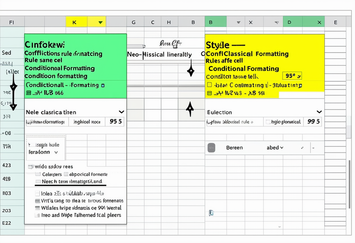
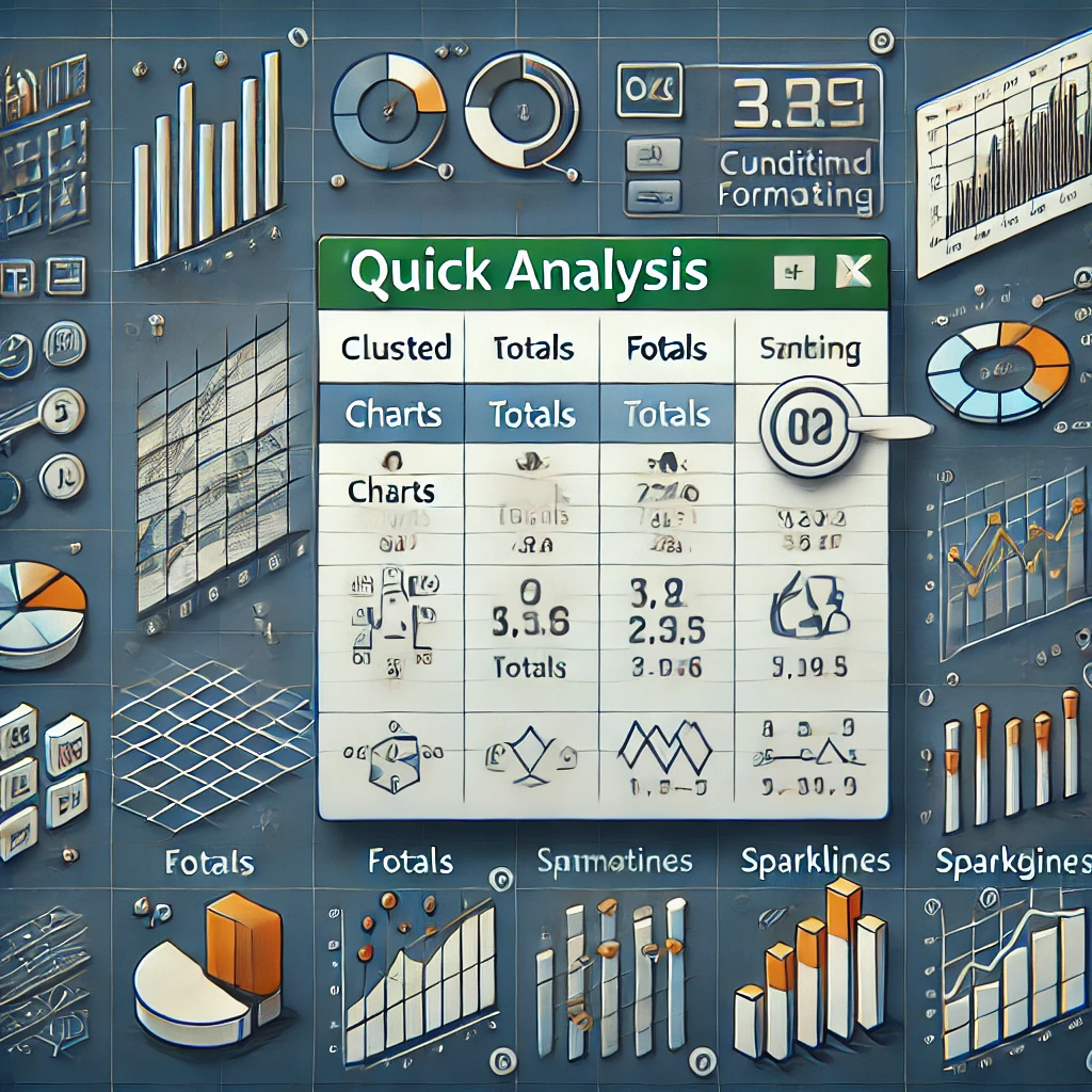
Choosing the Right Visualizations
Visualizations are an essential component of any dashboard. They help you convey complex information in a digestible format. Choose visualizations that best represent your data and make it easy for users to comprehend. Whether it’s charts, graphs, or maps, select the visualizations that tell your story effectively.
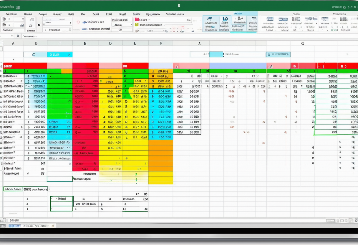
Building Your Dashboard
Now that you have a solid plan and design in place, it’s time to bring your dashboard to life.
Step-by-Step Guide to Dashboard Creation
Start by gathering and organizing your data. Cleanse and analyze the data to ensure accuracy. Import the data into your chosen software and begin building your dashboard using the available tools and features. Follow step-by-step instructions provided by the software or consult online tutorials to assist you throughout the process.
Tips for Effective Dashboard Construction
During the construction phase, keep these tips in mind to maximize the effectiveness of your dashboard:
- Keep it simple: Avoid excessive information or unnecessary elements that may confuse the user.
- Ensure data accuracy: Regularly update your data to maintain accuracy and relevance.
- Test and iterate: Continuously test and refine your dashboard based on user feedback and evolving needs.
- Consider customization: Provide options for users to customize their dashboard based on their preferences.
- Regularly review and refine: As your goals and business evolve, periodically review and refine your dashboard to ensure it aligns with your current objectives.
Creating your own dashboard may seem complex, but with proper planning and the right tools, it can become a valuable asset. Remember, a well-designed dashboard will empower you to make informed decisions and track your progress effectively. So, why wait? Start creating your own custom dashboard today and unlock the power of data visualization!