Table of Contents
Creating a dashboard in Excel can transform large amounts of data into a visually appealing and user-friendly format. Whether you want to track your business’s performance, analyze financial data, or monitor project progress, Excel dashboards can provide valuable insights. In this article, we will explore the basics of Excel dashboards, the necessary steps to prepare your data, and a step-by-step guide to creating your own customized dashboard. We will also discuss various ways to enhance and personalize your dashboard to make it more interactive and informative.
Understanding the Basics of Excel Dashboard
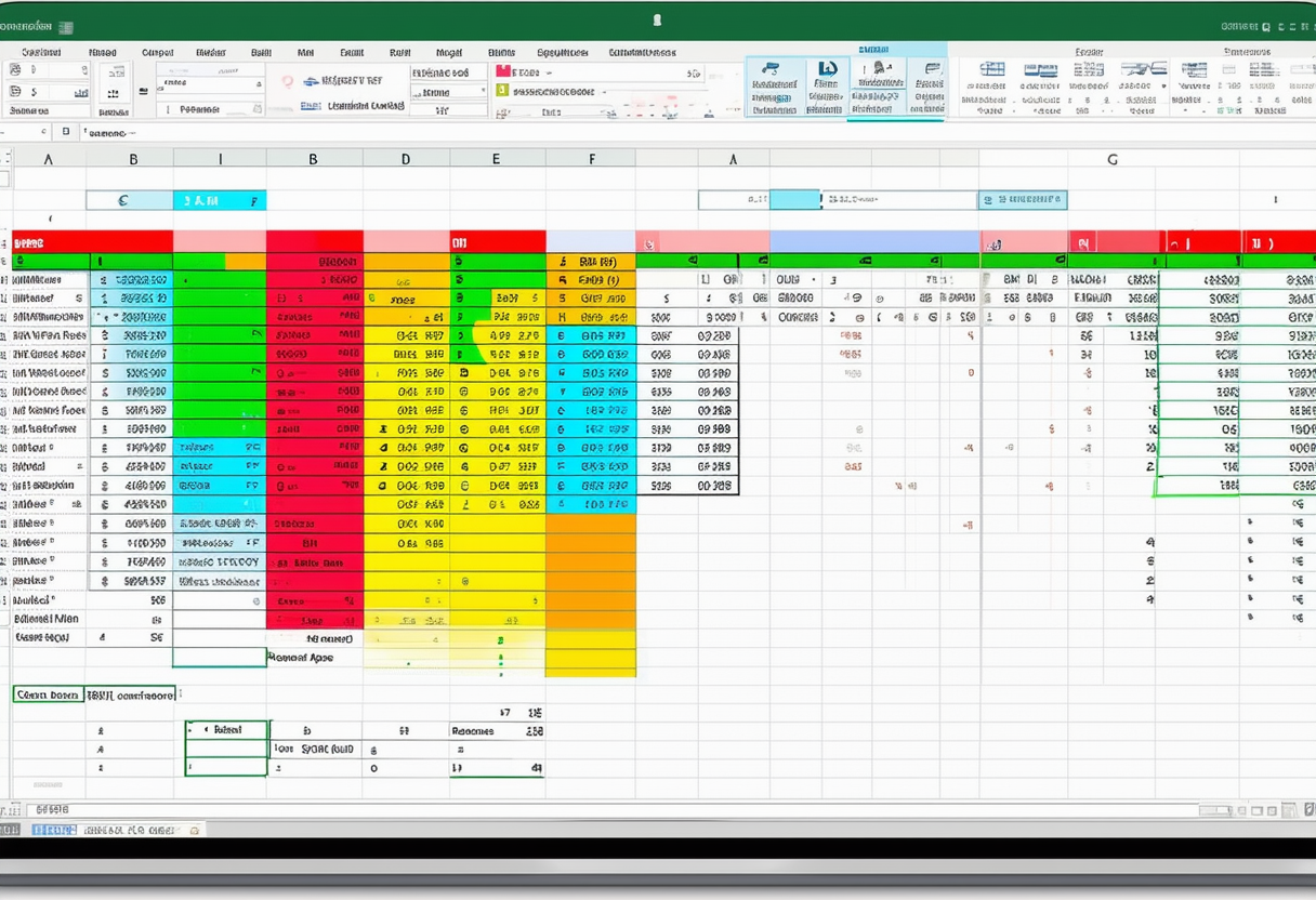
An Excel dashboard is a visual representation of data that brings together multiple elements such as tables, charts, and graphs on a single page. It allows you to monitor key performance indicators (KPIs), track trends, and analyze data in real-time. The main purpose of a dashboard is to provide a concise overview of complex information, making it easier to understand and make data-driven decisions.
Excel dashboards are widely used across various industries and functions, from finance and marketing to operations and human resources. They serve as powerful tools for decision-makers to gain insights and drive strategic actions based on data analysis. By leveraging the capabilities of Excel, users can create dynamic and visually appealing dashboards that facilitate data interpretation and communication.
What is an Excel Dashboard?
An Excel dashboard is essentially a collection of visual elements that present data in a logical and structured manner. These elements can include tables, charts, graphs, and other visualizations that display relevant information. Dashboards are highly customizable, allowing you to choose the type of data you want to display, the layout, and the design.
Moreover, Excel dashboards can incorporate advanced features such as interactive slicers, timelines, and conditional formatting to enhance the user experience and enable deeper exploration of data insights. With the ability to connect to external data sources and automate data refresh, Excel dashboards offer a seamless way to stay connected to real-time information and make informed decisions swiftly.
Benefits of Using an Excel Dashboard
There are several benefits to using an Excel dashboard. Firstly, it allows you to consolidate and visualize large amounts of data in a single view. This makes it easier to identify trends, patterns, and outliers. Dashboards also provide real-time updates, ensuring that you always have the most up-to-date information at your fingertips. Additionally, Excel dashboards are highly interactive, allowing users to filter and drill down into specific data points for deeper analysis. This enhances decision-making and enables users to derive insights more quickly.
Furthermore, Excel dashboards promote collaboration and data-driven discussions within organizations by providing a common platform for stakeholders to align on key metrics and performance indicators. By sharing dashboards across teams, departments, or management levels, organizations can foster a culture of transparency and accountability, driving continuous improvement and strategic alignment.
Preparing Your Data for Dashboard Creation
Before you can create an Excel dashboard, it is important to properly prepare your data. This involves organizing and cleaning up your data to ensure its accuracy and consistency.
Proper data preparation is crucial for the success of your dashboard project. It sets the foundation for accurate analysis and visualization, enabling you to derive meaningful insights and make informed decisions based on reliable data.
Organizing Your Data
The first step in preparing your data is to organize it in a structured format. This typically involves creating separate worksheets within your Excel workbook for each data source or category. Each worksheet should contain the relevant data in a tabular format, with each column representing a specific attribute or variable.
Organizing your data in a structured manner not only makes it easier to work with but also enhances the efficiency of your dashboard creation process. By segregating data into distinct categories, you can streamline data analysis and visualization, leading to a more coherent and user-friendly dashboard.
Cleaning Up Your Data
Once your data is organized, it’s essential to clean it up to remove any errors, duplicates, or inconsistencies. This may involve checking for missing values, correcting formatting issues, and removing redundant or irrelevant data. Cleaning up your data ensures the accuracy and reliability of your dashboard.
Data cleaning is a critical step that helps maintain data integrity and ensures that your dashboard reflects the most up-to-date and accurate information. By eliminating inaccuracies and discrepancies, you can enhance the credibility of your dashboard and make it a valuable tool for data-driven decision-making.
Step-by-Step Guide to Creating an Excel Dashboard
Now that your data is properly organized and cleaned up, it’s time to start building your Excel dashboard. The following step-by-step guide will walk you through the process.
Setting Up Your Workbook
Begin by creating a new workbook in Excel. This will serve as the foundation for your dashboard. Give your workbook a descriptive name and save it in a location where you can easily access it.
Creating Pivot Tables
Pivot tables are an effective way to summarize and analyze large datasets. They allow you to group and filter data, calculate totals and averages, and perform other calculations. Create pivot tables based on the data sources you have prepared, selecting the necessary fields for analysis.
Designing the Dashboard Layout
The next step is to design the layout of your dashboard. Consider the key metrics and KPIs you want to highlight and how you want to present them visually. Arrange the various elements, such as charts, tables, and graphs, in a logical and intuitive manner. Use gridlines, borders, and colors to enhance readability and highlight important information.
Adding Charts and Graphs
Charts and graphs are powerful visual tools that can provide a clear representation of your data. Depending on the nature of your data, choose the appropriate chart type, such as bar graphs, line graphs, or pie charts. Use the data from your pivot tables to create the charts and customize them to match your dashboard’s design.
Incorporating Slicers and Timelines
Slicers and timelines allow users to interact with your dashboard and filter data based on specific criteria. These interactive elements can be used to slice and dice data, drill down into specific time periods, or select particular categories. Incorporating slicers and timelines adds interactivity and enhances the user experience of your dashboard.
Customizing Your Excel Dashboard
Once you have created the basic structure of your Excel dashboard, you can customize it further to meet your specific needs and preferences.
Choosing the Right Chart Types
Review the charts and graphs you have included in your dashboard and ensure that they are effectively conveying the information you want to present. Experiment with different chart types to find the most suitable representation for your data. Consider using combination charts to display multiple data series in a single graph.
Applying Conditional Formatting
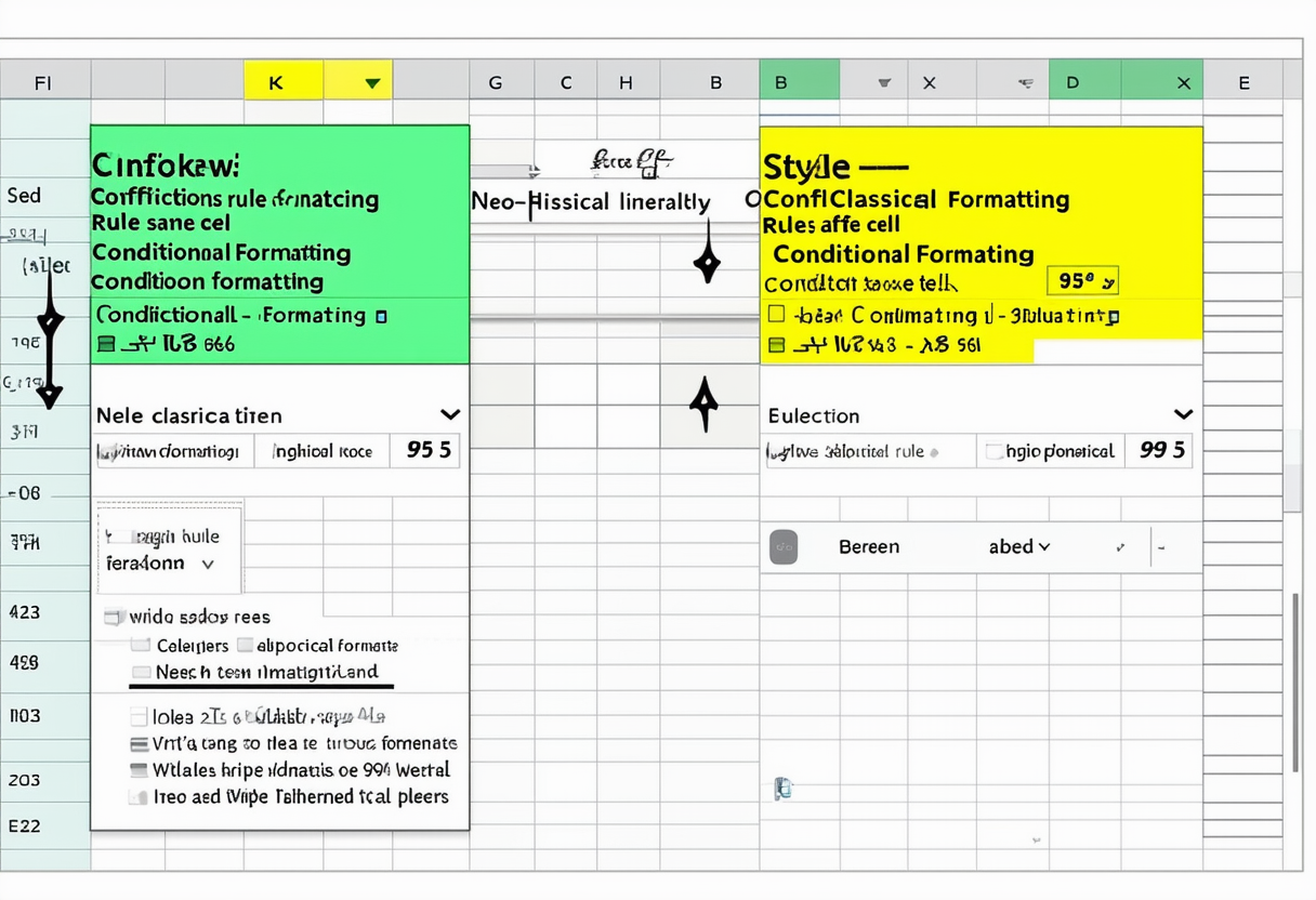
Conditional formatting is a powerful feature in Excel that allows you to highlight specific data points based on conditions you define. Apply conditional formatting to your dashboard to draw attention to critical information, identify trends, or signal areas of concern. Use color schemes and formatting options that align with your overall design.
Adding Interactive Elements
Enhance the interactivity of your dashboard by incorporating additional elements such as buttons, drop-down lists, or scrollbars. These interactive features can be used to navigate through large datasets, filter data dynamically, or drill down into specific details. Make sure these interactive elements are intuitive and easy to use.
In conclusion, creating a dashboard in Excel can be a game-changer for analyzing and visualizing your data. By understanding the basics of Excel dashboards, adequately preparing your data, and following a step-by-step guide, you can create an informative and visually appealing dashboard. Additionally, customizing your dashboard by selecting the right chart types, applying conditional formatting, and adding interactive elements will make it even more powerful and user-friendly. So, why wait? Start exploring the world of Excel dashboards and unlock the full potential of your data!
