Table of Contents
Yes, Excel does have a dashboard function. In this article, we will explore this feature and understand its capabilities. We will also discuss the basics of Excel and its advanced features. Additionally, we will delve into the concept of a dashboard, its purpose, and benefits. Furthermore, we will look at Excel’s built-in dashboard tools and learn how to create a dashboard in Excel. Moreover, we will analyze the limitations of Excel’s dashboard function and explore alternative software options with dashboard functions. Lastly, we will provide tips for maximizing Excel’s dashboard function, including best practices and troubleshooting common issues.
Understanding Excel’s Capabilities
Before we dive into Excel’s dashboard function, it is important to have a solid understanding of Excel itself. Excel is a powerful spreadsheet program developed by Microsoft. With its vast array of features, it is widely used for data analysis, financial calculations, and project management. Excel allows users to organize and manipulate data efficiently, making it an indispensable tool for businesses and individuals alike.
The Basics of Excel
Excel is equipped with various functions and formulas that simplify complex calculations. Users can perform basic arithmetic operations, such as addition, subtraction, multiplication, and division, using formulas. Furthermore, Excel provides a wide range of functions, such as SUM, AVERAGE, MAX, and MIN, to perform advanced calculations on data sets.
Additionally, Excel offers users the ability to create charts and graphs to visualize data. These visual representations make it easier to identify trends, patterns, and outliers in the data. Furthermore, Excel allows users to customize charts and graphs by adding various formatting elements, such as titles, labels, and legends.
Advanced Features of Excel
Beyond the basic features, Excel provides advanced capabilities that enhance its functionality. Users can use pivot tables to analyze large datasets and summarize them based on different criteria. Pivot tables enable users to arrange, group, and filter data dynamically, providing valuable insights into the data.
Furthermore, Excel supports automation through macros. Users can record a series of actions in Excel and save them as a macro. They can then execute the macro with a single click, automating repetitive tasks and saving time.
Exploring the Concept of a Dashboard
Now that we have a solid understanding of Excel, let’s explore the concept of a dashboard. A dashboard is a visual display of important information, often presented on a single screen. It provides a snapshot of key metrics, allowing users to monitor and analyze data quickly and efficiently. Dashboards are commonly used in business settings to track performance, make data-driven decisions, and communicate information effectively.
What is a Dashboard?
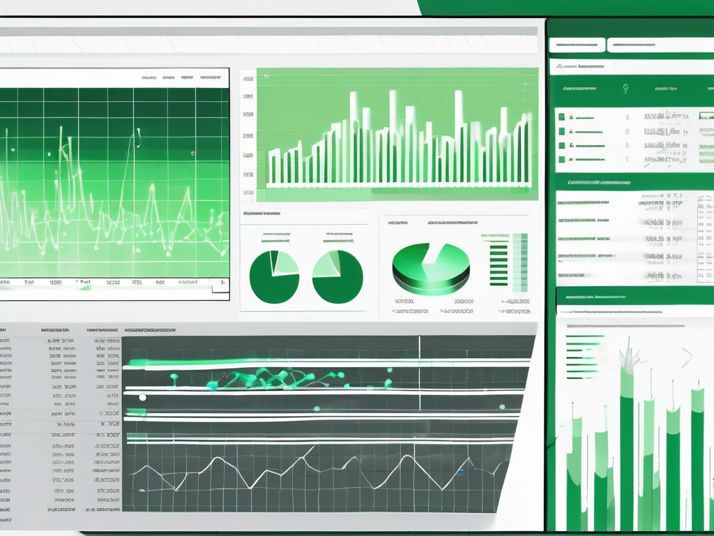
A dashboard typically consists of charts, graphs, tables, and other visual elements that represent relevant data. It condenses complex information into easily digestible visuals, enabling users to grasp the big picture at a glance. Dashboards can be customized to cater to specific needs and can be interactive, allowing users to drill down into the data for further analysis.
The Purpose and Benefits of a Dashboard
The purpose of a dashboard is to provide actionable insights by presenting data in a visually appealing and easy-to-understand format. By displaying key metrics and performance indicators, dashboards enable users to identify trends, anomalies, and areas that require attention. This empowers decision-makers to make informed choices and take proactive measures to drive improvement.
Moreover, dashboards promote data transparency and facilitate collaboration. They enable teams to align their efforts, monitor progress, and share insights seamlessly. Furthermore, dashboards foster data-driven conversations and facilitate discussions based on real-time information.
Excel’s Dashboard Function
Now that we have a clear understanding of dashboards, let’s explore Excel’s dashboard function. Excel offers built-in tools and features that allow users to create effective and dynamic dashboards directly within the program.
Excel’s Built-in Dashboard Tools
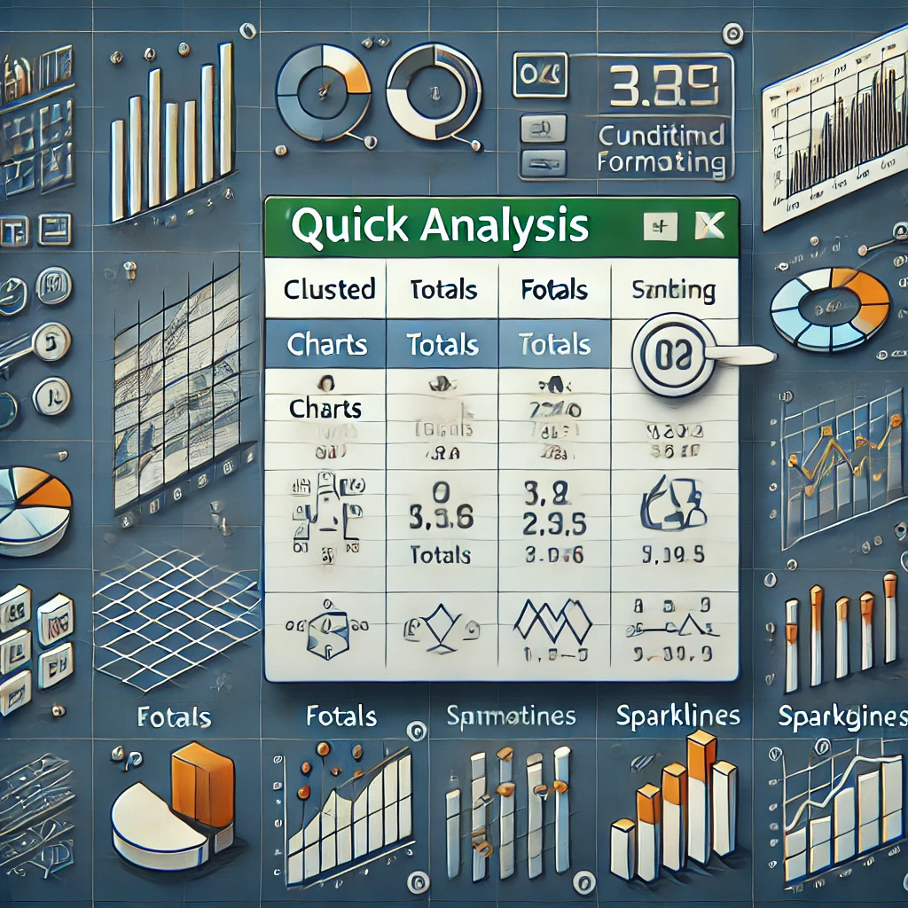
Excel provides various built-in tools that users can leverage to create interactive dashboards. These tools include pivot tables, slicers, and sparklines.
Pivot tables are particularly useful for summarizing and analyzing data. They enable users to arrange and filter data based on different criteria, enabling a comprehensive view of the data. Moreover, pivot tables can be easily linked to charts and graphs, allowing users to create dynamic visualizations.
Slicers are another powerful tool offered by Excel. They allow users to filter data dynamically by selecting specific values from a slicer interface. This feature enhances user interactivity and enables quick and targeted analysis of the data.
Sparklines, on the other hand, are compact and condensed charts that convey trends and patterns within a single cell. They are particularly useful for visualizing data series and providing a quick overview of the data.
Creating a Dashboard in Excel
To create a dashboard in Excel, users can follow a simple step-by-step process. First, they need to define the key metrics and data points that they want to display on the dashboard. Next, they can create pivot tables based on the data and arrange them in a logical layout on a worksheet.
Once the pivot tables are in place, users can customize the design and formatting of the dashboard. They can add charts, graphs, and sparklines to visualize the data effectively. Additionally, users can use slicers to filter the data dynamically, allowing for greater interactivity.
Finally, users can add additional elements, such as titles, headings, and logos, to enhance the appearance of the dashboard. They can also set up interactivity by using hyperlinks or macros to navigate between different sections of the dashboard.
Limitations and Alternatives to Excel’s Dashboard
While Excel’s dashboard function offers many advantages, it is important to be aware of its limitations. Firstly, Excel may not be suitable for handling extremely large datasets. Processing and analyzing vast amounts of data can slow down the performance of Excel and make it cumbersome to work with.
Additionally, Excel’s built-in dashboard tools may lack some advanced functionality and flexibility. Users with complex requirements or specific design preferences may find that Excel’s dashboard function falls short of their expectations.
In such cases, it may be worth exploring alternative software options that specialize in dashboard creation. Some popular alternatives include Tableau, Power BI, and Google Data Studio. These tools offer advanced features, intuitive interfaces, and seamless integration with various data sources.
Potential Drawbacks of Excel’s Dashboard
Excel’s dashboard function has its limitations and potential drawbacks. Apart from the performance issues with large datasets mentioned earlier, there can be challenges in maintaining data integrity and accuracy. Human errors, such as incorrect formulas or data entry mistakes, can compromise the reliability of the dashboard.
Furthermore, Excel’s dashboard function requires a certain level of proficiency in using the program. Users with limited knowledge or experience may struggle to create complex and dynamic dashboards without adequate guidance or training.
Other Software with Dashboard Functions
To overcome the limitations of Excel’s dashboard function, users can consider exploring alternative software options that specialize in dashboard creation. These tools offer advanced features, intuitive interfaces, and seamless integration with various data sources.
Tableau, for example, is a market-leading data visualization software that enables users to create interactive and visually stunning dashboards. It offers a wide range of visualization options, advanced analytics capabilities, and seamless data connectivity.
Power BI, on the other hand, is a business analytics tool provided by Microsoft. It empowers users to analyze data, share insights, and collaborate in a cloud-based environment. Power BI provides a comprehensive set of tools for dashboard creation, including interactive visuals, natural language queries, and AI-powered features.
Google Data Studio is a free and user-friendly tool that enables users to create interactive dashboards and reports. It integrates seamlessly with other Google products, such as Google Sheets and Google Analytics, making it a convenient choice for users already utilizing the Google ecosystem.
Tips for Maximizing Excel’s Dashboard Function
To make the most of Excel’s dashboard function, here are some tips and best practices to consider:
Best Practices for Excel Dashboards
- Define clear objectives and key metrics: Before creating a dashboard, clearly define the objectives and key metrics you want to track. This will ensure that your dashboard focuses on the most relevant information.
- Keep it simple and focused: Avoid cluttering your dashboard with excessive data or unnecessary elements. Keep it clean and focused to facilitate quick and efficient data analysis.
- Use visual hierarchy: Arrange the elements of your dashboard in a logical and intuitive manner. Use color, size, and position to convey importance and hierarchy of information.
- Ensure data accuracy: Double-check formulas, data sources, and calculations to ensure the accuracy of your dashboard. Mistakes can undermine the credibility of your insights and decisions.
- Regularly update and maintain the dashboard: As data changes, update your dashboard to reflect the latest information. Regular maintenance ensures the dashboard remains relevant and useful.
Troubleshooting Common Issues with Excel’s Dashboard
When working with Excel’s dashboard function, users may encounter some common issues. Here are a few troubleshooting tips to overcome these challenges:
- Ensure data integrity: Validate the accuracy and consistency of your data by cross-referencing it with the original source. This helps identify any discrepancies or errors in your dashboard.
- Optimize performance: If your Excel workbook is slow or unresponsive, consider optimizing its performance by minimizing calculations, reducing unnecessary formatting, and using efficient formulas.
- Improve visual aesthetics: If you find your dashboard visually unappealing or difficult to interpret, consider redesigning it. Experiment with different chart types, colors, and layouts to enhance readability and clarity.
- Seek help from Excel communities: If you encounter a specific problem or have a question about Excel’s dashboard function, reach out to online Excel communities or forums. These communities are filled with experienced users who can provide guidance and solutions.
By following these tips and troubleshooting common issues, you can maximize Excel’s dashboard function and create compelling and insightful dashboards.
Conclusion
Excel’s dashboard function provides a powerful and versatile tool for creating informative and interactive dashboards. It offers a range of built-in features that allow users to summarize, analyze, and visualize data effectively. However, it is important to be aware of Excel’s limitations and explore alternative software options if necessary.
By understanding Excel’s capabilities, exploring the concept of a dashboard, and learning how to utilize Excel’s built-in tools, users can leverage the dashboard function to track key metrics, make data-driven decisions, and communicate insights effectively. By following best practices and troubleshooting common issues, users can maximize Excel’s dashboard function and create visually appealing and impactful dashboards.
So, whether you are a business professional, a data analyst, or simply someone looking to gain valuable insights from your data, Excel’s dashboard function can be a valuable tool in your arsenal.