Table of Contents
Excel is widely known as a powerful spreadsheet tool, but can it also be used to create dashboards? In this article, we will explore Excel’s capabilities as a dashboard tool and discuss its strengths and limitations in this area. We will also look at alternative software options for creating dashboards and provide a conclusion on whether Excel is a suitable choice for this purpose.
Understanding Excel’s Interface
Before delving into Excel’s dashboard capabilities, let’s first familiarize ourselves with its interface. Excel’s interface consists of various elements, including the ribbon, worksheets, and cells. Users can perform calculations, create charts and graphs, and organize data within these cells.
One key element of Excel’s interface is the Quick Access Toolbar, located above the ribbon. This toolbar allows users to customize and add shortcuts for frequently used commands, increasing efficiency and productivity. Additionally, users can personalize the ribbon by adding or removing tabs and commands to suit their specific needs and workflow.
Basic Features of Excel
Excel offers a range of basic features that are essential for data manipulation and analysis. Users can input and edit data easily, perform mathematical operations using formulas and functions, and sort and filter data based on specific criteria.
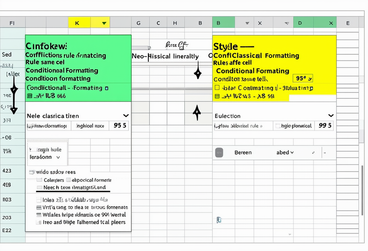
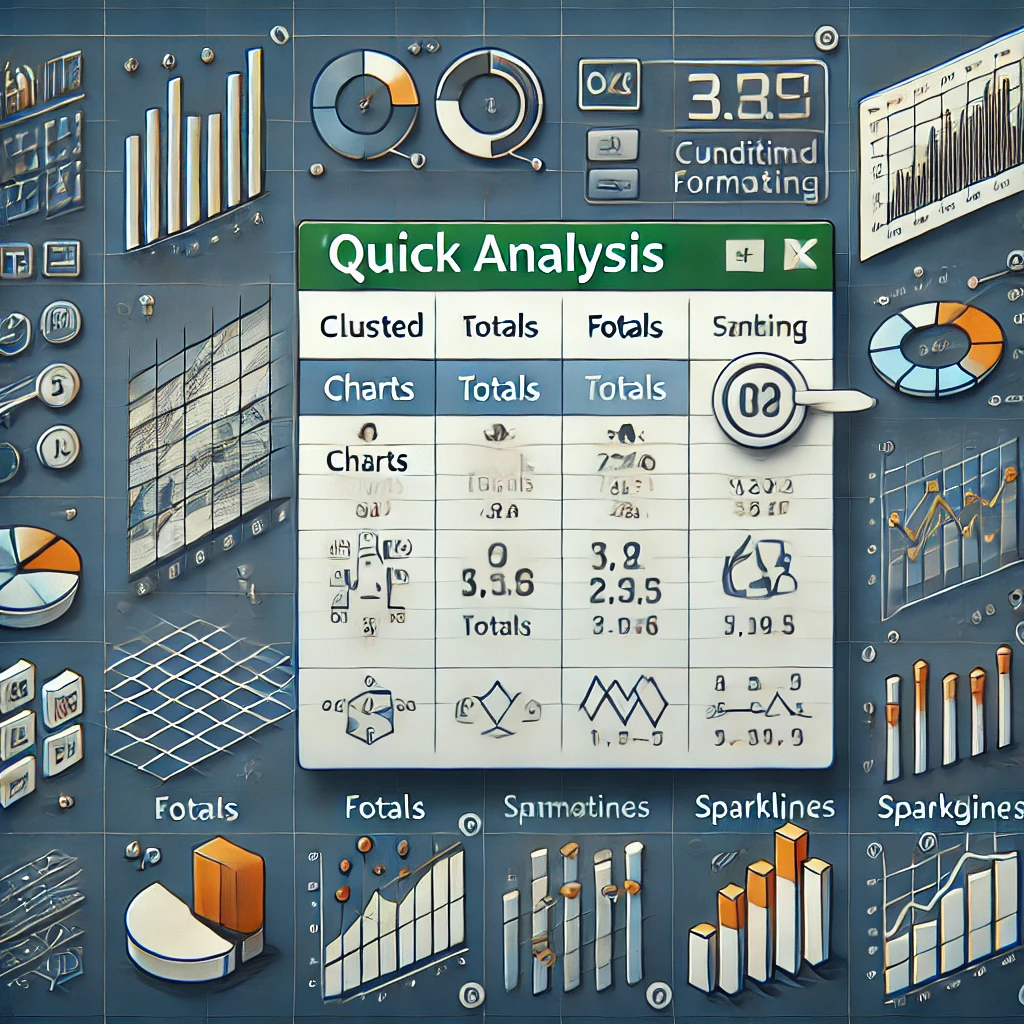
Another fundamental feature of Excel is its conditional formatting capabilities. Users can visually highlight important data points, trends, or outliers by applying various formatting rules to cells, making it easier to interpret and analyze the information at a glance.
Advanced Features of Excel
Beyond the basic functionalities, Excel also provides advanced features such as pivot tables, goal-seeking analysis, and scenario manager. These tools allow users to summarize and analyze large datasets, perform complex calculations, and create dynamic reports.
Furthermore, Excel’s Power Query tool enables users to connect, transform, and model data from multiple sources, making it easier to combine and analyze information from different databases or files. This feature is particularly useful for users working with big data or complex data structures.
The Concept of a Dashboard
Now that we have a clear understanding of Excel’s interface and features, let’s explore the concept of a dashboard. In the context of data analysis, a dashboard is a visual representation of key metrics, trends, and insights. It provides a concise and interactive overview of data, allowing users to quickly assess and analyze information.
When we delve deeper into the world of dashboards, we uncover a fascinating realm where data visualization meets strategic decision-making. A well-designed dashboard acts as a strategic tool that empowers users to not only comprehend complex data sets but also derive actionable insights that drive business growth and innovation.
What is a Dashboard?
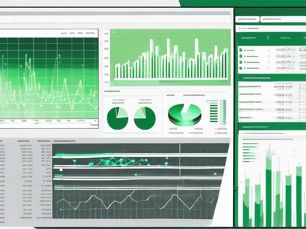
A dashboard typically consists of charts, graphs, tables, and other visual elements that present data in a visually appealing and user-friendly manner. It is designed to enable users to make data-driven decisions and gain valuable insights at a glance.
Moreover, the evolution of dashboard design has seen a shift towards incorporating interactive elements such as filters, drill-down capabilities, and real-time data updates. These features enhance user engagement and allow for a more personalized and dynamic data exploration experience.
Importance of a Dashboard in Data Analysis
Dashboards play a crucial role in data analysis by providing a centralized view of relevant information. They eliminate the need to sift through vast amounts of data and enable users to spot trends, anomalies, and patterns quickly. Dashboards also facilitate effective communication and collaboration among teams by presenting data in a clear and understandable format.
Furthermore, the adaptability of dashboards across various industries and functions highlights their versatility as a decision support tool. From tracking sales performance in retail to monitoring patient outcomes in healthcare, dashboards serve as a universal language that transcends traditional data barriers, fostering a culture of data-driven decision-making in organizations worldwide.
Excel as a Dashboard Tool
With its extensive range of features and flexibility, can Excel effectively serve as a dashboard tool? Let’s explore.
When delving into the realm of using Excel as a dashboard tool, it’s essential to highlight the software’s versatility. Excel not only excels in data analysis and computation but also offers a robust set of tools for data visualization. This multifaceted approach makes it a compelling choice for creating dynamic and interactive dashboards that cater to a wide range of analytical needs.
Excel’s Data Visualization Capabilities
Excel offers a variety of chart types and customization options, allowing users to create visually appealing and informative visualizations. Users can choose from bar charts, line graphs, pie charts, and more to represent their data effectively. Additionally, Excel provides formatting features like colors, fonts, and styles to enhance the visual impact.
Moreover, Excel’s integration with Power Query and Power Pivot further enhances its data visualization capabilities. These powerful tools enable users to connect to various data sources, transform raw data into meaningful insights, and create compelling visualizations that drive decision-making processes.
Creating Interactive Dashboards in Excel
Excel allows users to create interactive dashboards using features like data validation, conditional formatting, and slicers. These tools enable users to filter and manipulate data dynamically, providing a more interactive experience. Interactive dashboards enhance user engagement and facilitate deeper exploration of data.
Furthermore, Excel’s ability to handle large datasets and perform complex calculations in real-time makes it a reliable choice for building interactive dashboards that deliver actionable insights. By leveraging Excel’s array of functions and formulas, users can create dynamic dashboards that adapt to changing data inputs, ensuring that decision-makers have access to up-to-date information at all times.
Limitations and Alternatives
While Excel offers powerful dashboard capabilities, it does have some limitations that should be considered.
When working with Excel dashboards, it’s important to note that the software may struggle when handling large datasets or real-time data. As the amount of information increases, Excel can become slow and cumbersome, impacting the overall user experience. Users may find themselves waiting longer for data to load or calculations to be processed, especially when dealing with vast amounts of data.
Potential Limitations of Excel Dashboards
Excel may not be the ideal choice for handling large datasets or real-time data. It can become slow and cumbersome when dealing with vast amounts of information. Additionally, creating complex visualizations or dynamic dashboards may require advanced skills and considerable effort.
Furthermore, the creation of complex visualizations or dynamic dashboards in Excel may pose challenges for users who are not well-versed in the software’s advanced features. Achieving sophisticated designs or interactive elements can be time-consuming and may require a steep learning curve for those unfamiliar with Excel’s more intricate functionalities.
Other Software for Dashboard Creation
For users who require more advanced dashboard features or deal with big data, there are alternative software options available. Tools like Tableau, Power BI, and Google Data Studio offer more robust visualization capabilities and can handle larger datasets with ease.
These alternative software options provide users with a wider range of visualization possibilities, including interactive charts, real-time updates, and seamless integration with various data sources. By leveraging these tools, users can create dynamic and engaging dashboards that effectively communicate insights from their data, even when working with extensive datasets or requiring real-time analytics.
Conclusion: Excel’s Dashboard Capabilities
In conclusion, Excel can indeed be used as a dashboard tool, thanks to its rich set of features and data visualization capabilities. It allows users to create visually appealing and interactive dashboards, enabling effective data analysis and decision-making. However, it is important to consider the limitations of Excel, such as its performance with large datasets, and explore alternative software options if needed.
Recap of Excel’s Dashboard Features
To summarize, Excel’s key dashboard features include its interface for data organization, basic and advanced analysis capabilities, and data visualization options. It also supports interactivity through features like data validation and conditional formatting.
Final Thoughts on Using Excel for Dashboards
While Excel provides a solid foundation for dashboard creation, it is essential to assess the specific requirements and limitations of each project. By weighing the pros and cons of using Excel as a dashboard tool, users can make an informed decision and choose the most suitable software for their needs.