Table of Contents
Gauge Chart
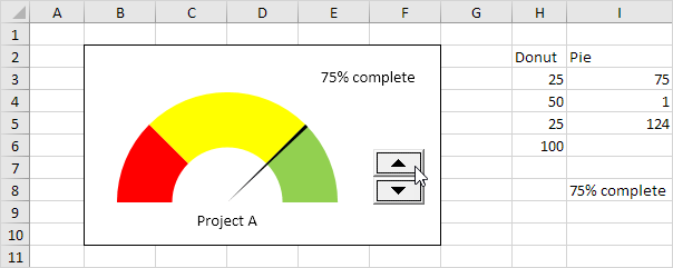
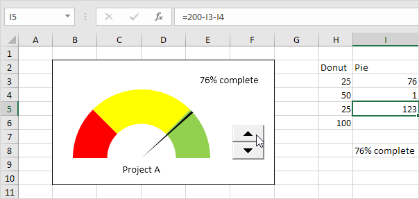
A gauge chart (or speedometer chart) combines a Doughnut chart and a Pie chart in a single chart. If you are in a hurry simply download the Excel file.
This is what the spreadsheet looks like.
To create a gauge chart execute the following steps.
1. Select the range H2:I6.
Note: the Donut series has 4 data points and the Pie series has 3 data points.
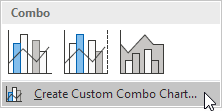
2. On the Insert tab in the Charts group click the Combo symbol.
3. Click Create Custom Combo Chart.
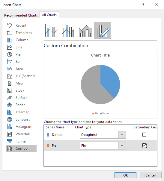
The Insert Chart dialog box appears.
4. For the Donut series choose Doughnut (fourth option under Pie) as the chart type.
5. For the Pie series choose Pie as the chart type.
6. Plot the Pie series on the secondary axis.
7. Click OK.
8. Remove the chart title and the legend.
9. Select the chart. On the Format tab in the Current Selection group select the Pie series.
10. On the Format tab in the Current Selection group click Format Selection and change the angle of the first slice to 270 degrees.
11. Hold down CTRL and use the ← and → keys to select a single data point. On the Format tab in the Shape Styles group change the Shape Fill of each point. Point 1 = No Fill point 2 = black and point 3 = No Fill.
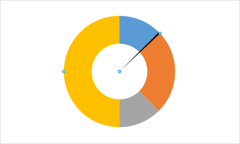
Result:
Explanation: the Pie chart is nothing more than a transparent slice of 75 points a black slice of 1 point (the needle) and a transparent slice of 124 points.
12. Repeat steps 9 to 11 for the Donut series. Point 1 = red point 2 = yellow point 3 = green and point 4 = No Fill.
Result:
13. Select the chart. On the Format tab in the Current Selection group select the Chart Area. In the Shape Styles group change the Shape Fill to No fill and the Shape Outline to No Outline.
14. Use the Spin Button to change the value in cell I3 from 75 to 76. The Pie chart changes to a transparent slice of 76 points a black slice of 1 point (the needle) and a transparent slice of 200 – 1 – 76 = 123 points. The formula in cell I5 ensures that the 3 slices sum up to 200 points.
