Table of Contents
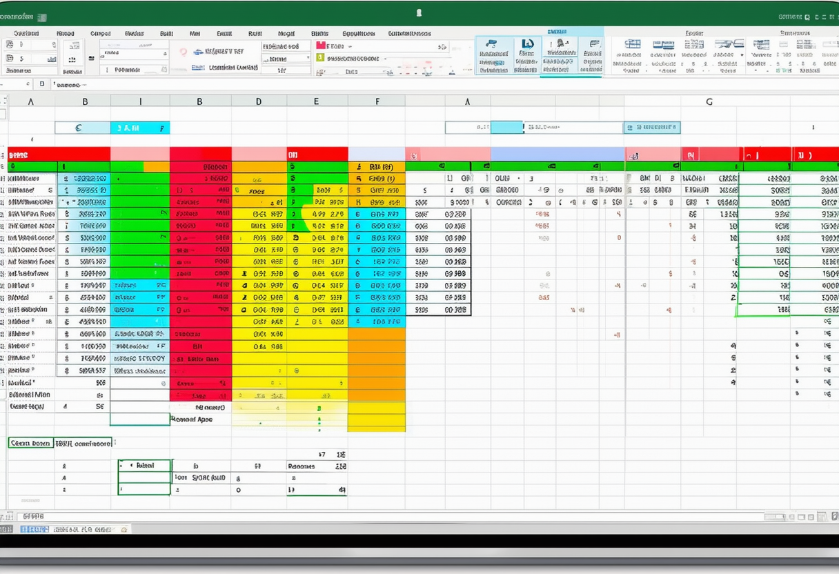
Data Analysis
This section illustrates the powerful features Excel has to offer to analyze data.
1Sort: You can sort your Excel data by one column or multiple columns. You can sort in ascending or descending order.
2 Filter: Filter your Excel data if you only want to display records that meet certain criteria.
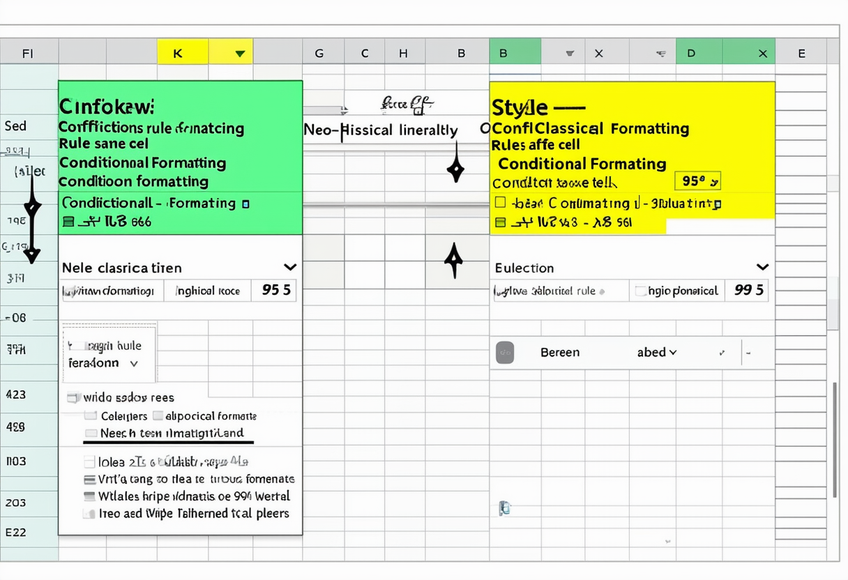
3 Conditional Formatting: Conditional formatting in Excel enables you to highlight cells with a certain color depending on the cell’s value.
4 Charts: A simple Excel chart can say more than a sheet full of numbers. As you’ll see creating charts is very easy.
5 Pivot Tables: Pivot tables are one of Excel’s most powerful features. A pivot table allows you to extract the significance from a large detailed data set.
6 Tables: Master Excel tables and analyze your data quickly and easily.
7 What-If Analysis: What-If Analysis in Excel allows you to try out different values (scenarios) for formulas.
8 Solver: Excel includes a tool called Solver that uses techniques from the operations research to find optimal solutions for all kind of decision problems.
9 Analysis ToolPak: The Analysis ToolPak is an Excel add-in program that provides data analysis tools for financial statistical and engineering data analysis.
Data Analysis+
Become an Excel pro! You can find related examples and features on the right side of each chapterat the bottom of each chapter. Below you can find a complete overview.
1 Sort: Custom Sort Order | Sort by Color | Reverse List | Randomize List | SORT function | Sort by Date | Alphabetize
2 Filter: Number and Text Filters | Date Filters | Advanced Filter | Data Form | Remove Duplicates | Outlining Data | Subtotal | Unique Values | FILTER function
3 Conditional Formatting: Manage Rules | Data Bars | Color Scales | Icon Sets | Find Duplicates | Shade Alternate Rows | Compare Two Lists | Conflicting Rules | Heat Map
4 Charts: Column Chart | Line Chart | Pie Chart | Bar Chart | Area Chart | Scatter Plot | Data Series | Axes | Trendline | Error Bars | Sparklines | Combination Chart | Gauge Chart | Thermometer Chart | Gantt Chart | Pareto Chart
5 Pivot Tables: Group Pivot Table Items | Multi-level Pivot Table | Frequency Distribution | Pivot Chart | Slicers | Update Pivot Table | Calculated Field/Item | GetPivotData
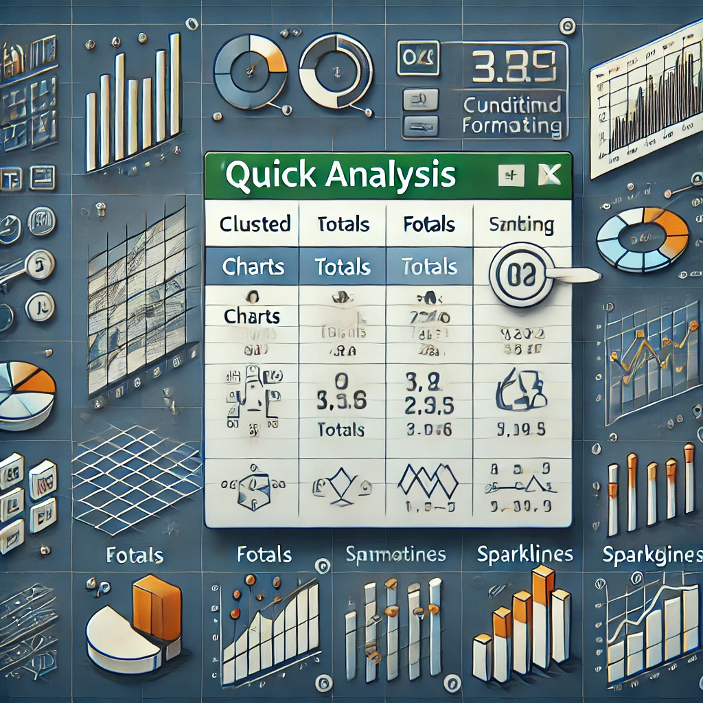
6 Tables: Structured References | Table Styles | Merge Tables | Table as Source Data | Remove Table Formatting | Quick Analysis
7 What-If Analysis: Data Tables | Goal Seek | Quadratic Equation
8 Solver: Transportation Problem | Assignment Problem | Capital Investment | Shortest Path Problem | Maximum Flow Problem | Sensitivity Analysis | System of Linear Equations
9 Analysis ToolPak: Histogram | Descriptive Statistics | Anova | F-Test | t-Test | Moving Average | Exponential Smoothing | Correlation | Regression
Best of Data Analysis+
Join more than 1 million monthly learners. Explore the best of what we offer master new Excel skills and become great at Excel. Happy learning!
1 Find Duplicates: This page teaches you how to find duplicate values (or triplicates) and how to find duplicate rows in Excel.
2 Histogram: This example teaches you how to make a histogram in Excel.
3 Regression: This example teaches you how to run a linear regression analysis in Excel and how to interpret the Summary Output.
4 Pareto Chart: A Pareto chart combines a column chart and a line graph. The Pareto principle states that for many events roughly 80% of the effects come from 20% of the causes.
5 Remove Duplicates: This example teaches you how to remove duplicates in Excel.
6 Gantt Chart: Excel does not offer Gantt as a chart type but it’s easy to create a Gantt chart by customizing the stacked bar chart type.
7 Line Chart: Line charts are used to display trends over time. Use a line chart if you have text labels dates or a few numeric labels on the horizontal axis.
8 Correlation: We can use the CORREL function or the Analysis Toolpak add-in in Excel to find the correlation coefficient between two variables.
9 Pie Chart: Pie charts are used to display the contribution of each value (slice) to a total (pie). Pie charts always use one data series.
10 Data Tables: Instead of creating different scenarios you can create a data table to quickly try out different values for formulas. You can create a one variable data table or a two variable data table.
11 t-Test: This example teaches you how to perform a t-Test in Excel. The t-Test is used to test the null hypothesis that the means of two populations are equal.
12 Advanced Filter: This example teaches you how to apply an advanced filter in Excel to only display records that meet complex criteria.
13 Frequency Distribution: Did you know that you can use pivot tables to easily create a frequency distribution in Excel? You can also use the Analysis Toolpak to create a histogram.
14 Scatter Plot: Use a scatter plot (XY chart) to show scientific XY data. Scatter plots are often used to find out if there’s a relationship between variables X and Y.
15 Anova: This example teaches you how to perform a single factor ANOVA (analysis of variance) in Excel. A single factor or one-way ANOVA is used to test the null hypothesis that the means of several populations are all equal.
16 Compare Two Lists: This page describes how to compare two lists in Excel using conditional formatting and COUNTIF.
17 Bar Chart: A bar chart is the horizontal version of a column chart. Use a bar chart if you have large text labels.
18 Goal Seek: If you know the result you want from a formula use Goal Seek in Excel to find the input value that produces this formula result.
19 Box and Whisker Plot: This example teaches you how to create a box and whisker plot in Excel. A box and whisker plot shows the minimum value first quartile median third quartile and maximum value of a data set.
20 Shade Alternate Rows: This example shows you how to use conditional formatting to shade alternate rows.
21 Quick Analysis: Use the Quick Analysis tool in Excel to quickly analyze your data. Quickly calculate totals quickly insert tables quickly apply conditional formatting and more.
22 Sparklines: Sparklines in Excel are graphs that fit in one cell. Sparklines are great for displaying trends. Excel offers three sparkline types: Line Column and Win/Loss.
23 Slicers: Use slicers in Excel to quickly and easily filter pivot tables. Connect multiple slicers to multiple pivot tables to create awesome reports.
24 Trendline: This example teaches you how to add a trendline to a chart in Excel.
25 Pivot Chart: A pivot chart is the visual representation of a pivot table in Excel. Pivot charts and pivot tables are connected with each other.
26 Subtotal: Use the SUBTOTAL function in Excel instead of SUM COUNT MAX etc. to ignore rows hidden by a filter or to ignore manually hidden rows.
27 Combination Chart: A combination chart is a chart that combines two or more chart types in a single chart.
28 Randomize List: This article teaches you how to randomize (shuffle) a list in Excel.
29 Unique Values: To find unique values in Excel use the Advanced Filter. You can extract unique values or filter for unique values.
30 Icon Sets: Icon Sets in Excel make it very easy to visualize values in a range of cells. Each icon represents a range of values.
Check out all 300 examples.